Colour Psychology 101: What Colours Say About Your Brand
What is colour psychology?
Everyone knows what brand the large yellow ‘M’ represents. What about the black and white swoosh? Or the red can? Colour psychology plays an important role in branding and consumer behaviour.
According to HubSpot, using a consistent colour palette can help increase brand recognition by up to 80%, which can help your brand stand out in an oversaturated market.
Colour psychology can help shape brand identity, create emotional connections with brands, influence purchasing decisions, and improve recall. We interact with branding every day, and we can easily recall the logos of large brands such as Starbucks, TikTok, Adidas and Google. They effortlessly evoke a certain feeling and encourage us to take action.
What Colours Can Indicate
Red
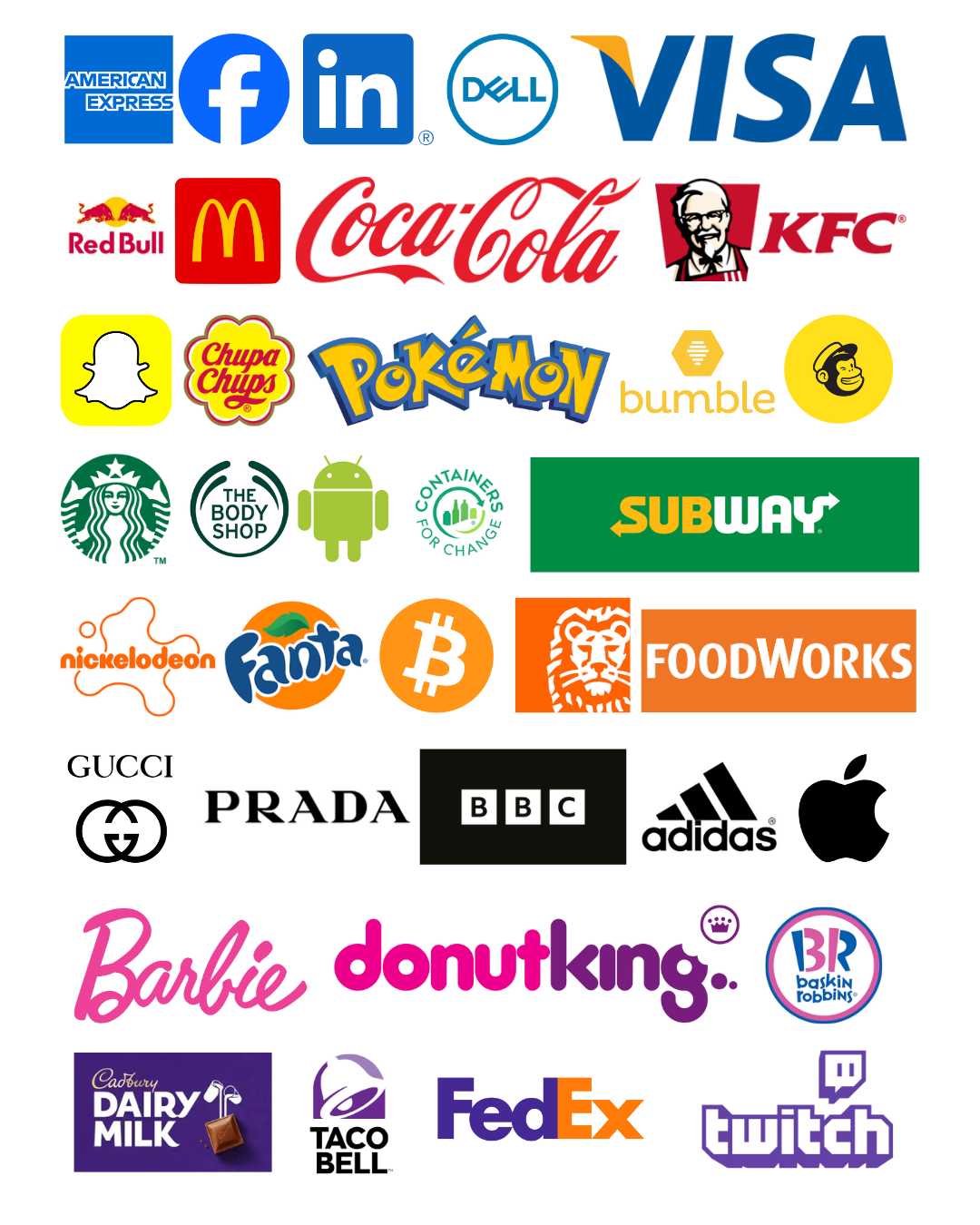
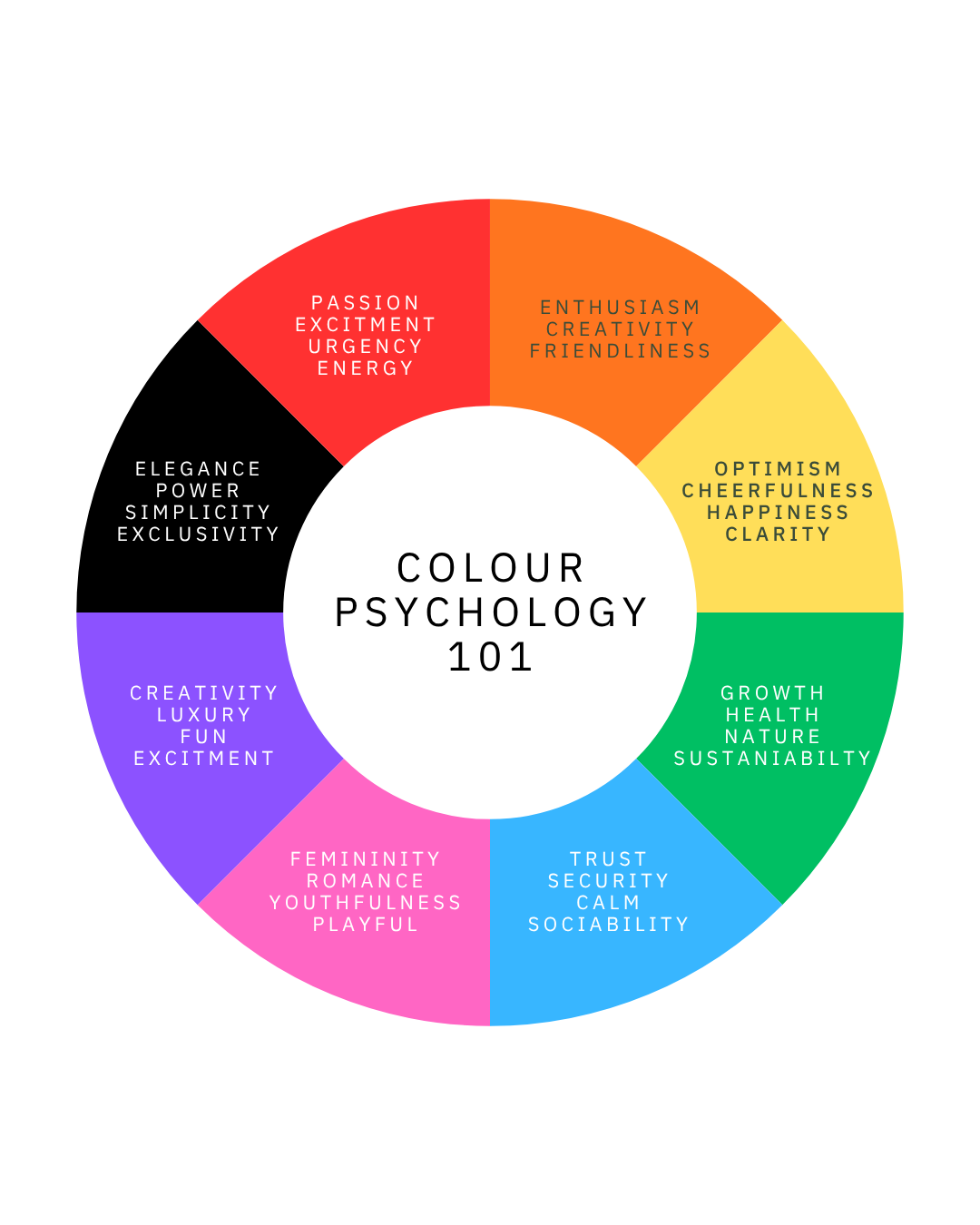
The use of the colour red in branding can mean passion, excitement, urgency and energy. Coca-Cola, YouTube and KFC all have strong, red branding. If you’re driving along at night and you’re feeling hungry, a bright red KFC logo is going to capture your attention, creating a sense of urgency. Coca-Cola has the same impact when you see it on the shelf and you’re craving something to quench your thirst.
Orange
Orange can signify enthusiasm, creativity and friendliness. Orange in branding helps to convey adventure (EasyJet), youthfulness (Nickelodeon) and fun (Fanta). Orange can also be associated with safety, being used as a uniform to improve visibility on construction sites or in warning signs.
Yellow
Optimism, cheerfulness, clarity and happiness can all be attributed to the colour yellow. McDonald’s, Snapchat, Pokémon and Mailchimp famously use yellow in their branding. Let’s take a look at McDonald’s as an example. They want their brand to be instantly recognisable, not just to adults, but to children too, to ensure that they become a household name and create demand.
Green
Ever heard the saying ‘green is good’? Green can stand for growth, health, nature and sustainability. Starbucks, Land Rover and BP all use green as their primary brand colour. Even if brands aren’t particularly sustainable, using green within their branding automatically evokes a sense of being more environmentally friendly.
Blue
Blue is always an interesting colour. It can signify trust, security, calm, sociability and professionalism, which is why brands like Meta, PayPal, Dell and IBM use blue in their branding. Brands that use blue want their customers to feel safe when using their products and services. A lot of social media brands use blue as their main brand colour (think LinkedIn, Meta, Twitter…before it became X).
Purple
The colour purple can mean creativity and luxury. Cadbury, Yahoo, Hallmark and Taco Bell all have purple as their main brand colour. This colour can evoke the sense of fun, playfulness and excitement. Historically, purple has been used to signify high status and divine power, hence why luxury brands tend to use purple within their colour palette.
Pink
Pink evokes a sense of femininity, romance and youth. Brands like Victoria’s Secret, Barbie and Donut King all use pink as one of their branding colours. It can feel nurturing, comforting and healing, whilst evoking feelings of positivity and playfulness. Whilst pale pinks offer a more gentle feeling, a vibrant pink is more energising and playful. Shades matter!
Black and White
Whilst black signifies sophistication, elegance, power and exclusivity, white can mean simplicity, cleanliness, purity and calm. Many tech, medical and luxury brands use these two colours together. Sony, Adidas, Uber, Puma, the BBC and Chanel are just some of the examples.
Negative Associations
It’s also important to consider that certain colours can portray negative emotions, which is why engaging a creative agency is key, so that colours are applied strategically.
A good example of this is when the colour red is associated with anger and hostility, or orange is associated with immaturity. All colours have both positive and negative connotations, which depend on how you’re using them and your target audience.
Avoiding Industry Trends
Each industry tends to have a colour that they fall into; social media giants gravitate towards blue or yellow, fast food brands use red or yellow, health care gravitates towards green, etc.
It’s a fine balance between helping your audience quickly understand what your offering is, versus not blending into the noise and looking the same as your competitors.
How To Incorporate Colour Psychology Into Your Branding
If you’re launching a brand or are looking at doing a brand refresh, here are a few things to consider before choosing a colour palette:
Think of your target audience.
Where is your brand operating? Different colours might resonate with different demographics or cultures.
What’s your brand personality?
If you’re a more professional and serious brand, choosing pink or purple might not suit your brand personality.
Deep dive into your competitors.
Don’t choose the same colour palette as your direct competitor. Be different. Stand out from the crowd.
Tie it back to your industry, but avoid the trend trap.
If you’re in tech or finance, many brands lean towards the colour blue as it can symbolise trust and security. Keep this in mind when selecting a colour palette. Whilst you want to avoid using the same colours as a competitor, you could use a different primary colour, and keep blue as a secondary colour, enabling you to benefit from colour psychology whilst standing out.
Using Colour Psychology Strategically
Looking for a more strategic approach to brand design? Get in touch. We are a Brisbane branding agency that delivers relevant, timeless and creative branding that stands out, backed by strategy and insights.


